Case Closed
2023
Logo Design
Visual Identity
Illustrations & Animated graphics
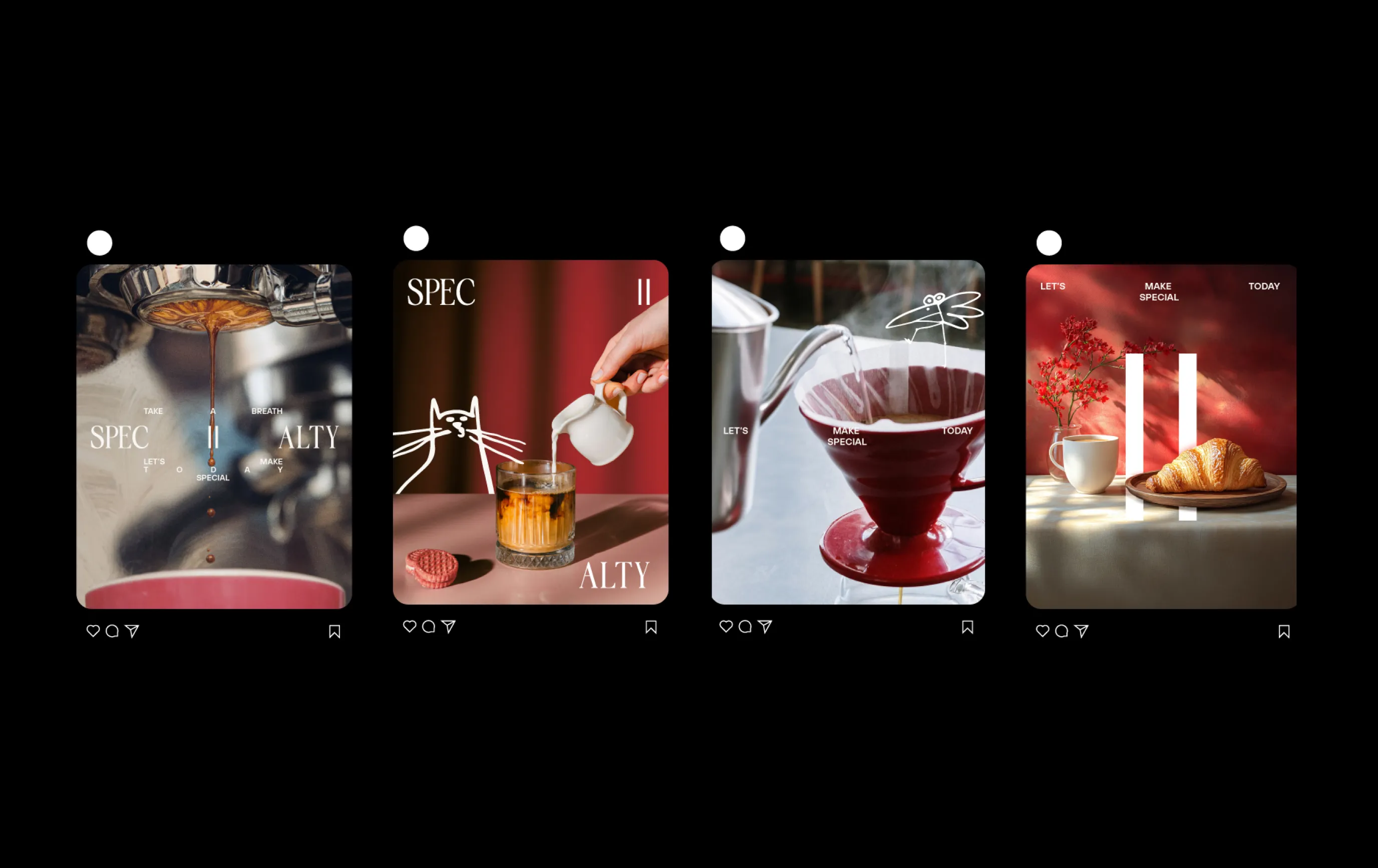
Social Media Support
Merch
App UI Design
UI Motion
Website Design
Design Direction, Digital Design
Sam Tipikin
Design Direction, Brand Design
Roman Myronov
Creative development
Kate Alatorceva
3D design
Roman Myronov
Brand Strategy
Ivan Grankin
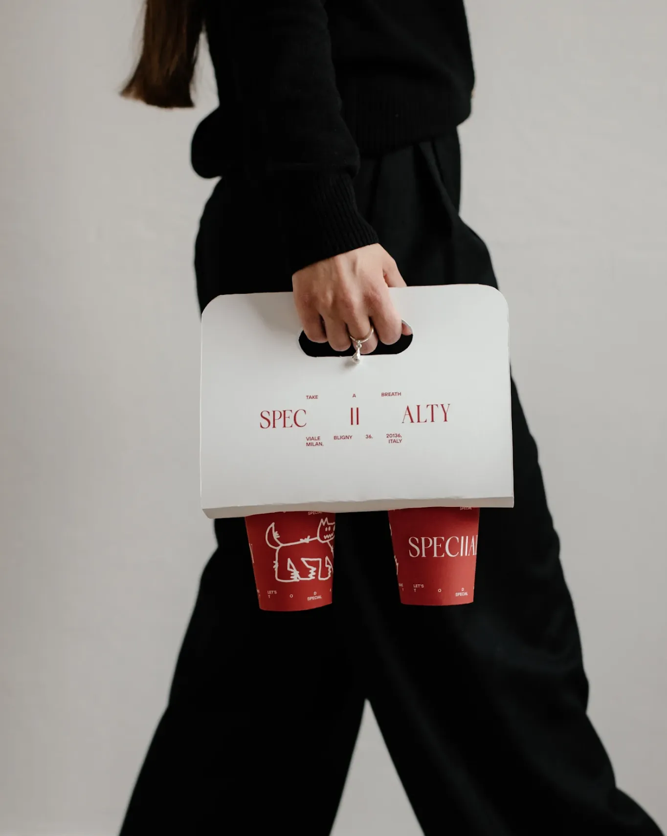
How do you create a space for rest in a city that never stops? For Milan's Specialty coffee, we designed a Red Dot Award-winning identity centered on the idea of a 'safe room.' The brand serves as a tranquil retreat from the urban rush, crafted for a high-quality experience and future growth.
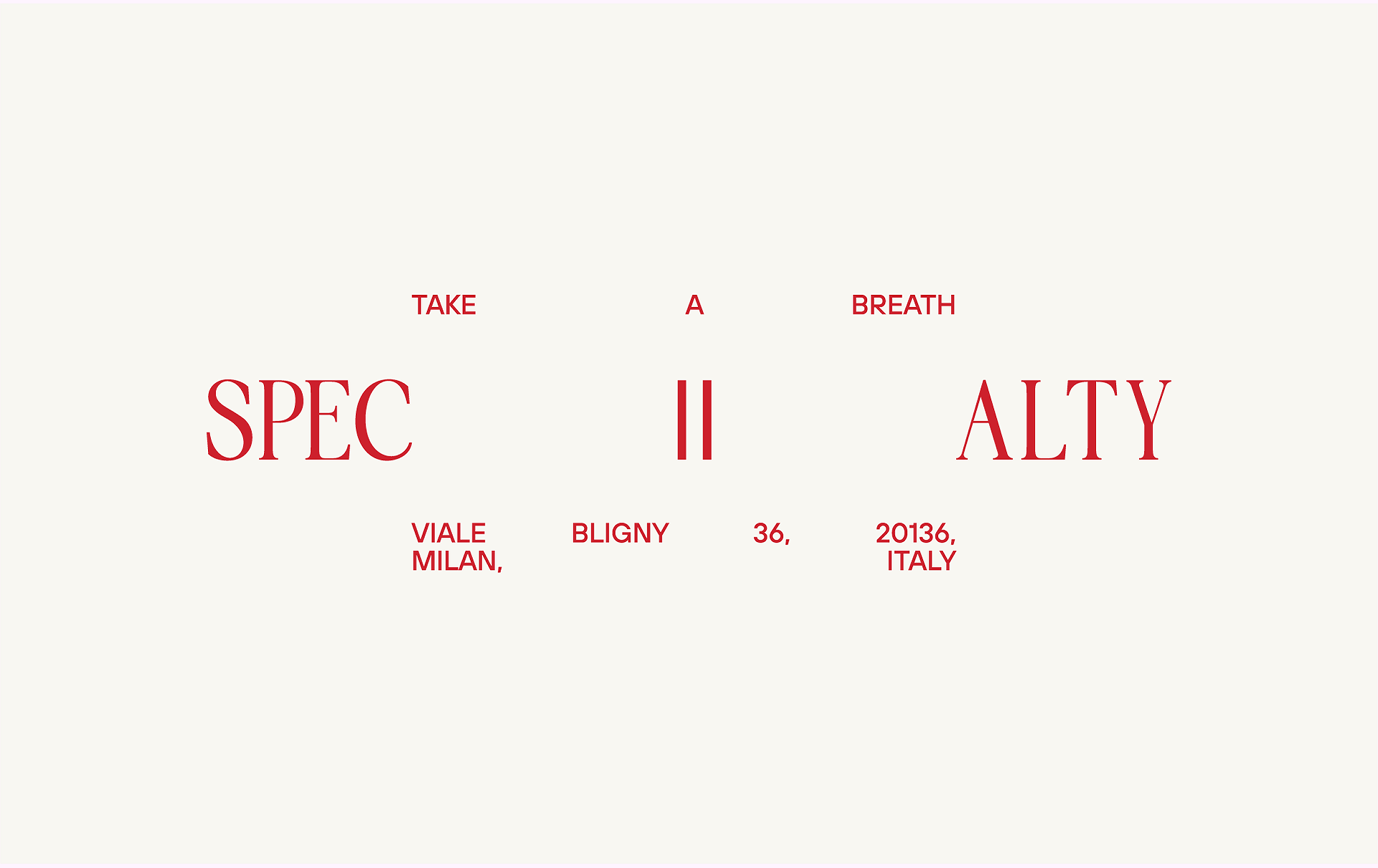
Specialty Coffee Shop Chain Branding
[Problem]
[Solution]
The client's brief was to develop a brand identity for a new coffee shop chain, with its first location in Milan. To understand the city's context, we conducted interviews with local residents to learn more about its character. The key takeaway was Milan’s industrial nature, business-oriented mindset, and fast-paced lifestyle. This insight led us to a core realization – people in Milan need a place to take a break.
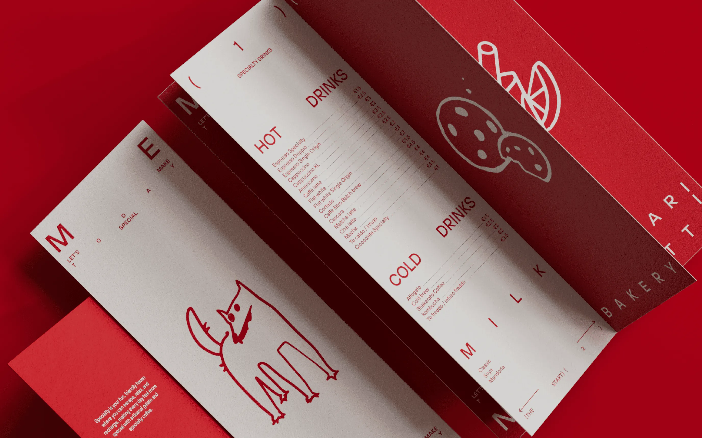
Combined with the founders' initial vision of creating a visually aesthetic space with a high-quality customer experience, we understood that Specialty could take on the role of a retreat, offering a safe room for anyone who needs it. We wanted to create brand identity that can fit nicely across both physical and digital channels and be scalable enough for a potential business expansion.
[Specialty is]
A place where people can hide and rest from the obsessive fast pace.
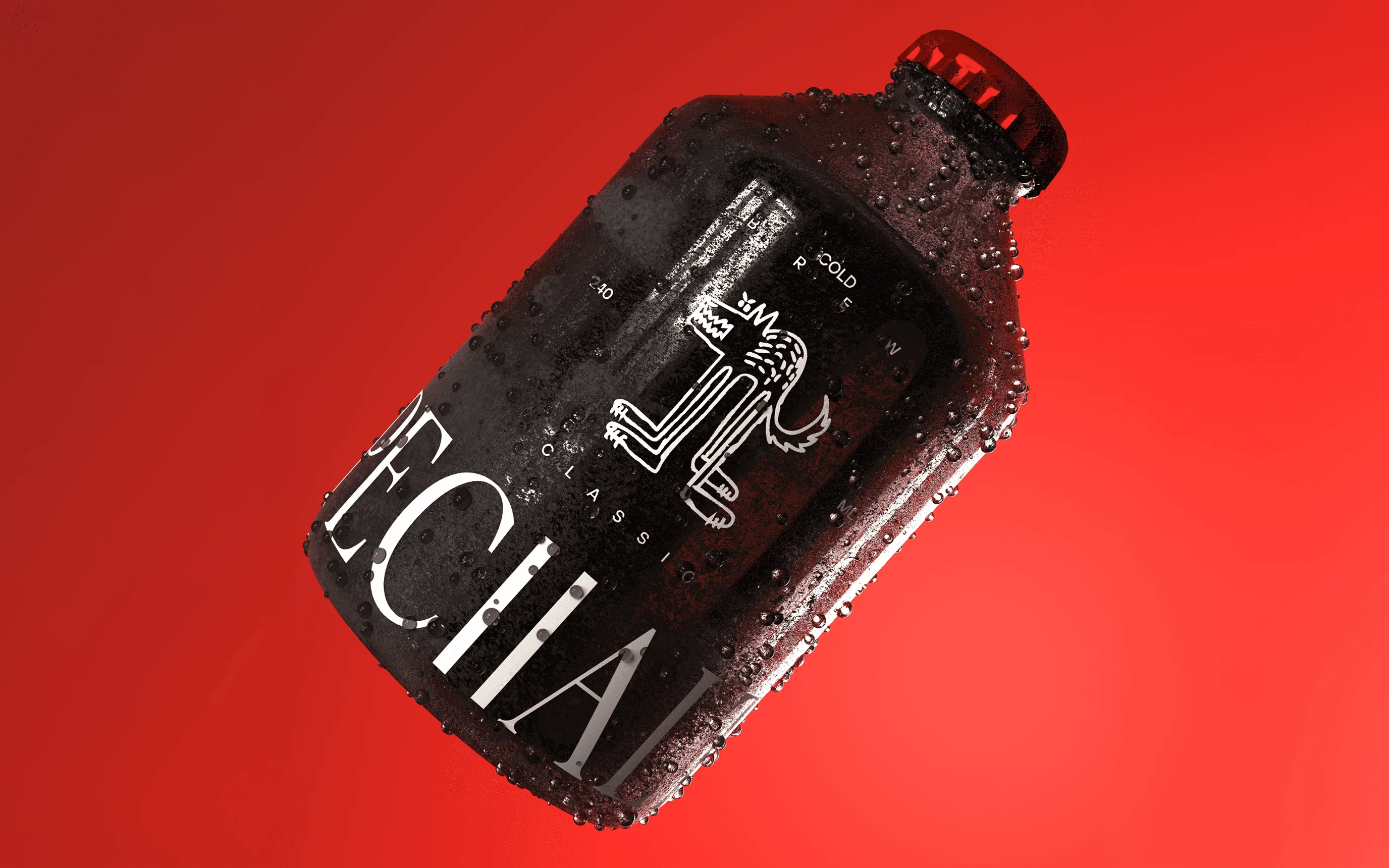
A Safe Room.
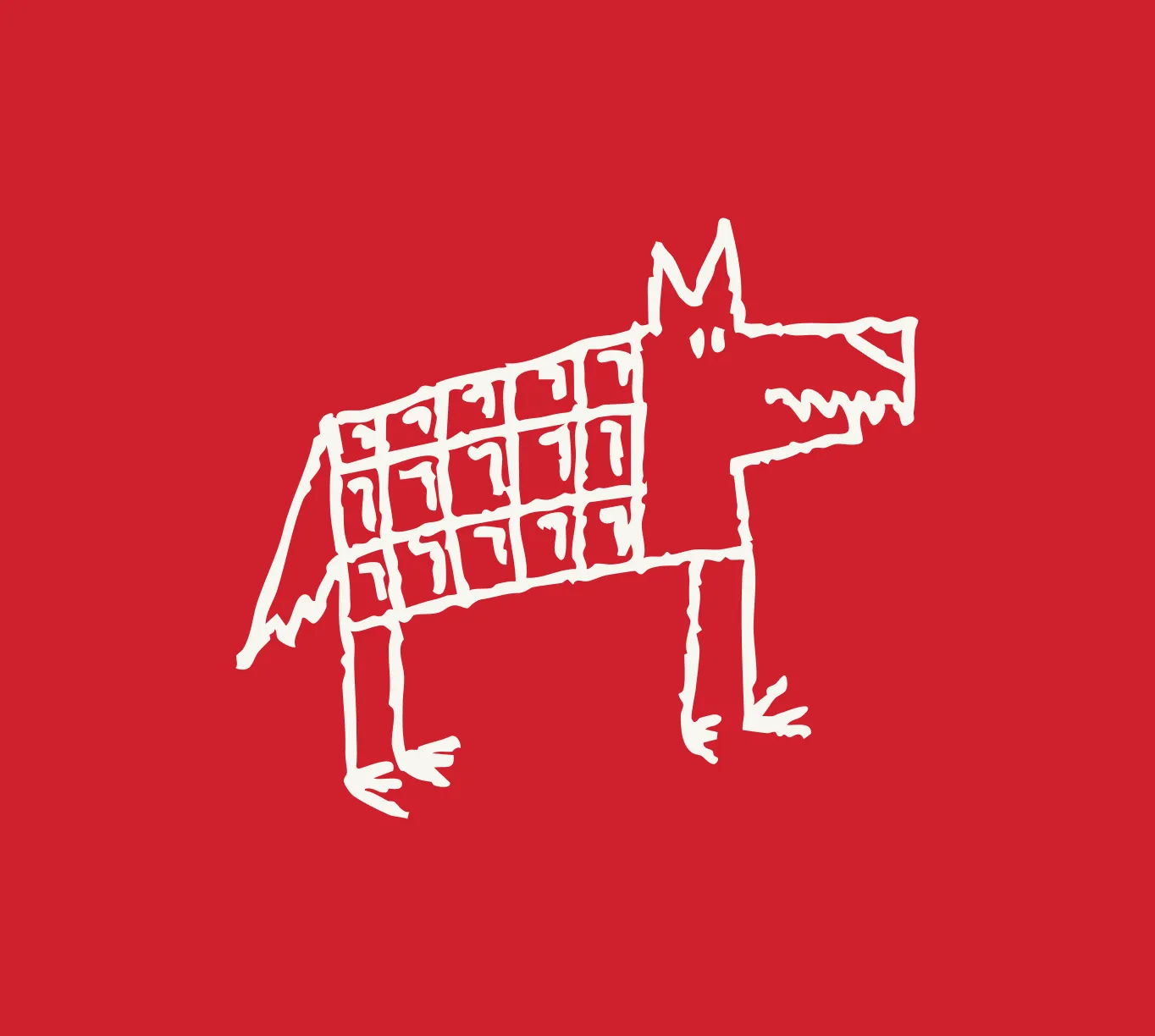
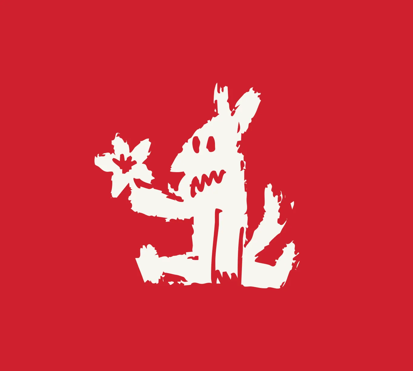
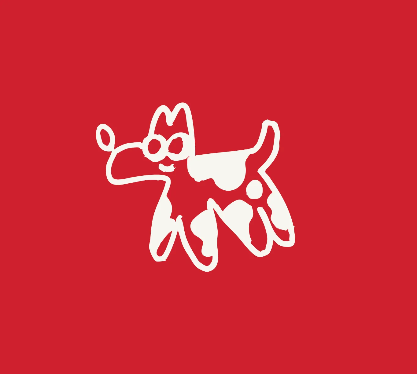
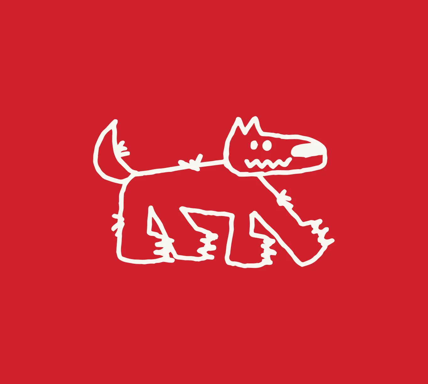
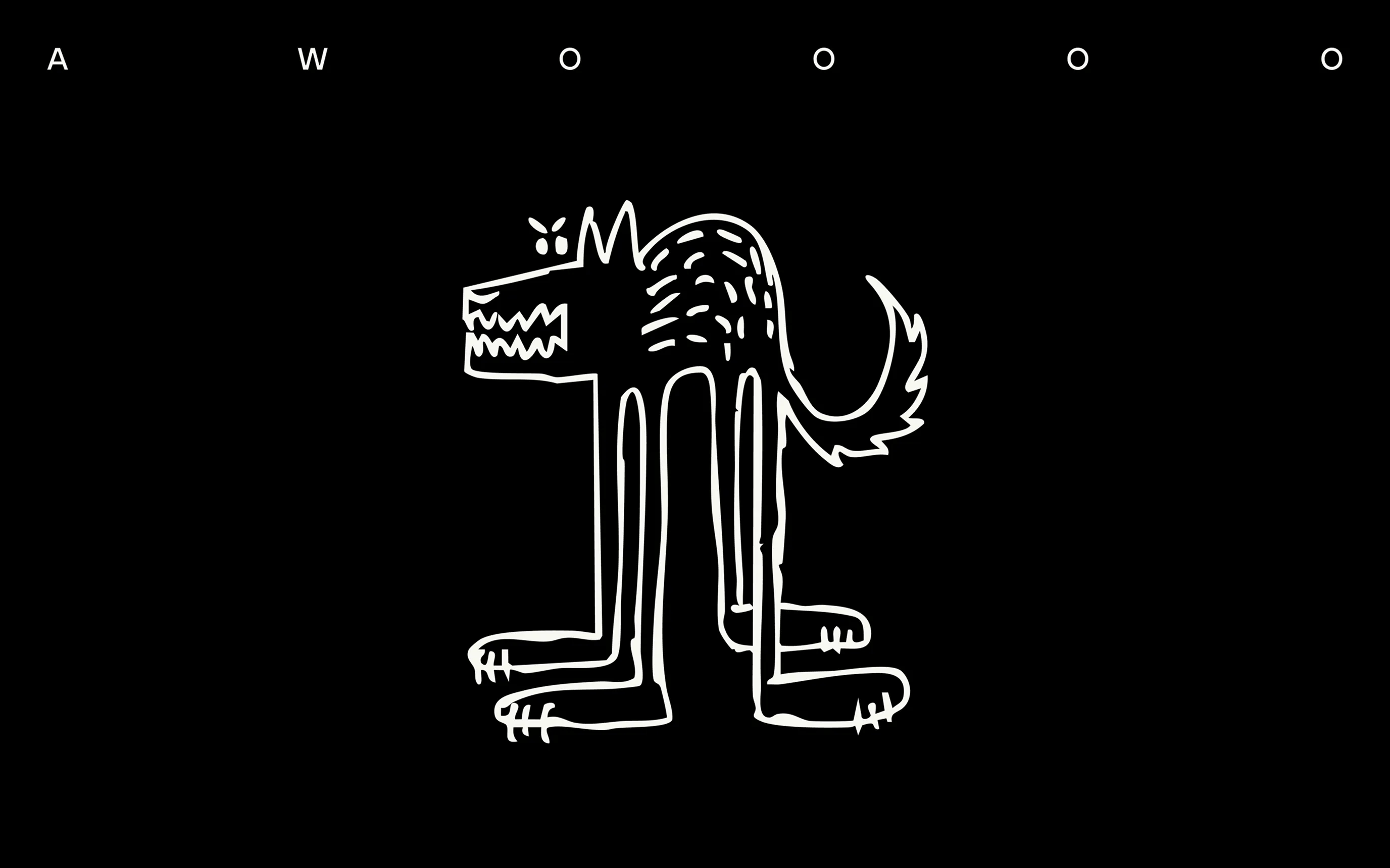
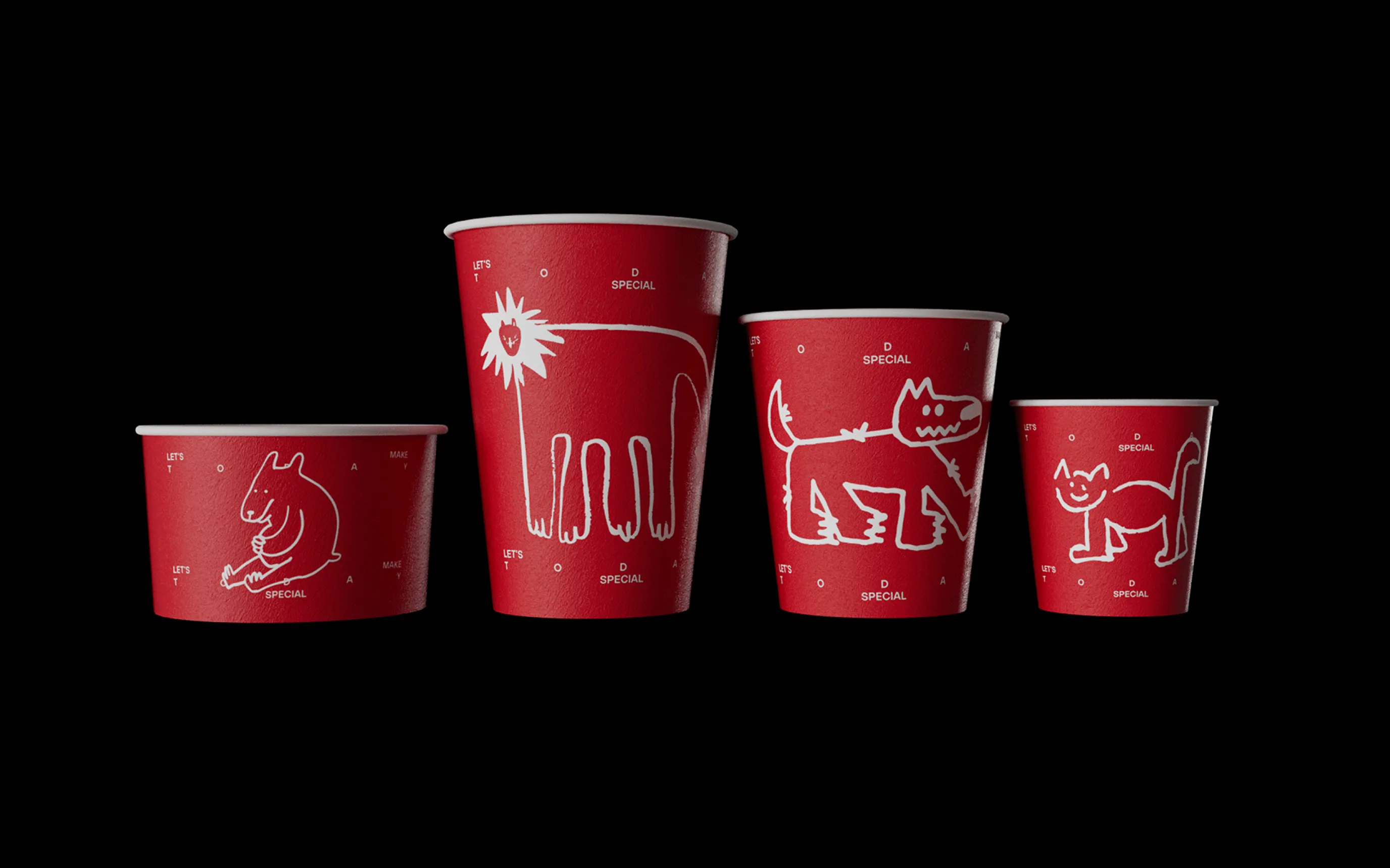
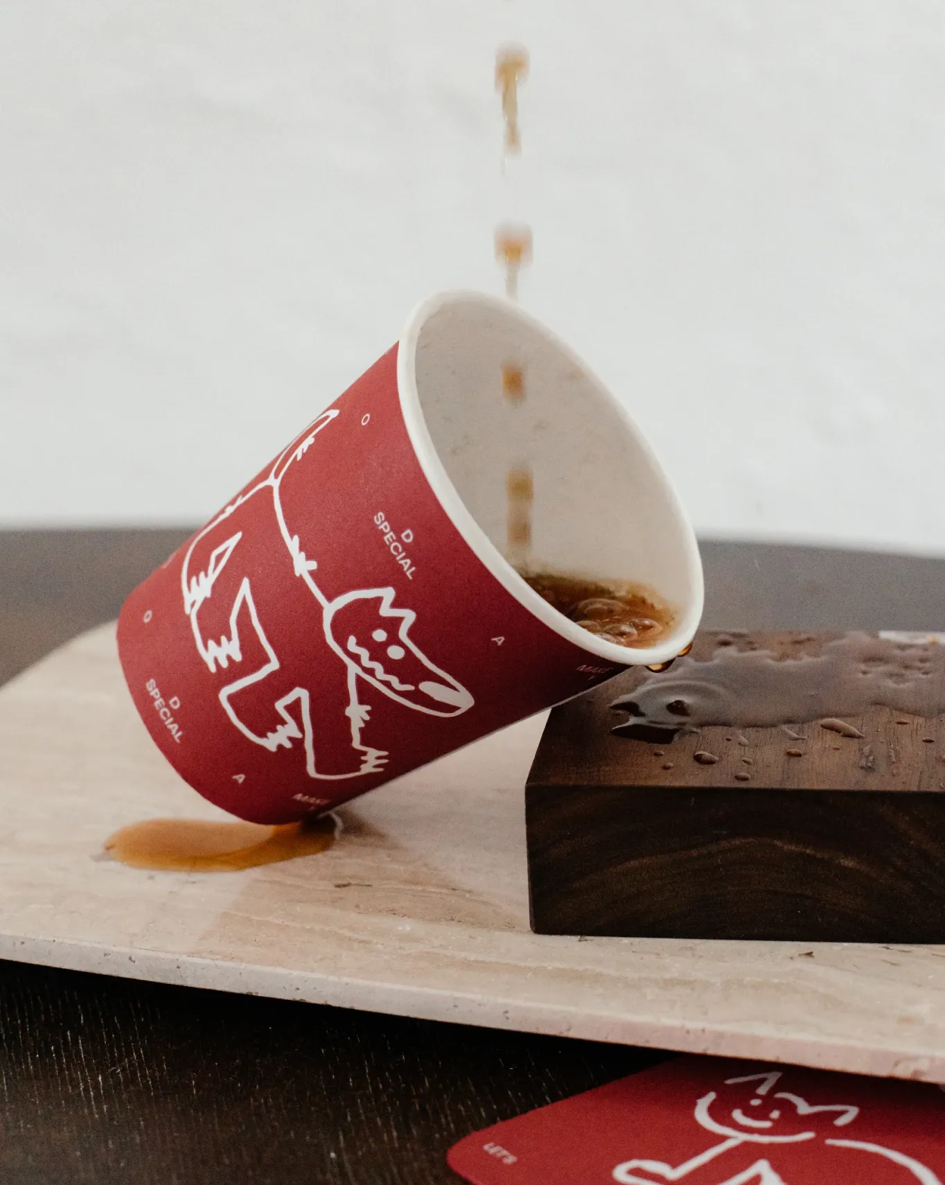
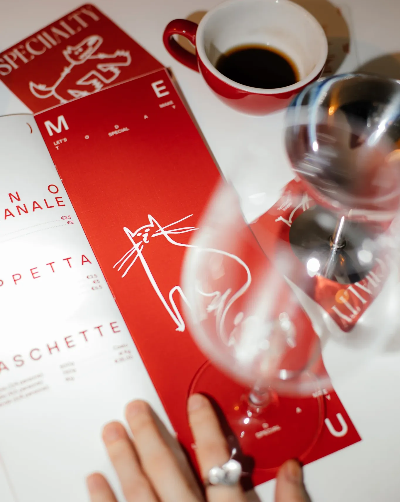
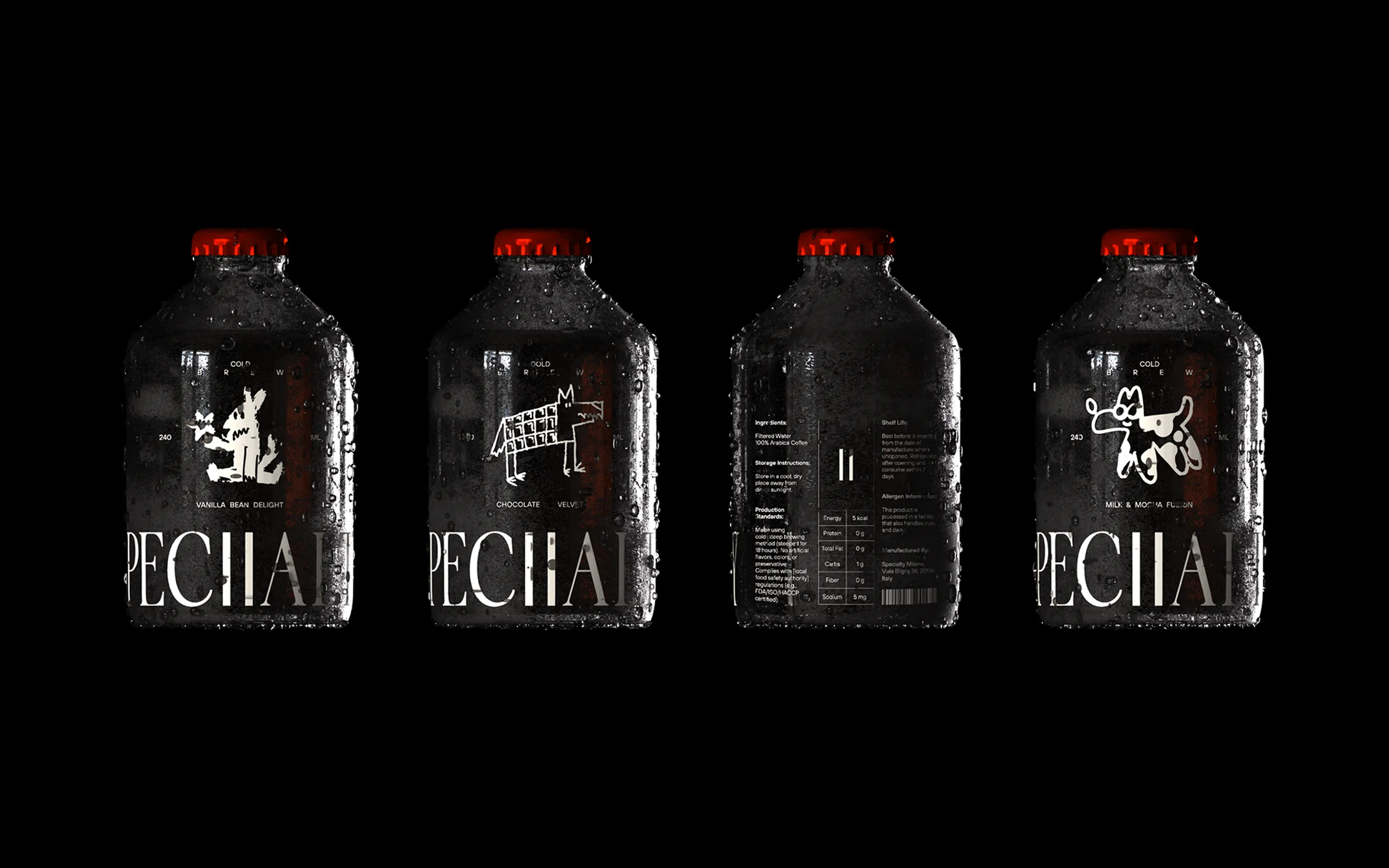
Based on this positioning idea, we developed the concept of an “anti-stress identity.” When trying to escape intrusive thoughts, the human brain often engages in motor and sensory activities. People tend to occupy their hands—drawing, twirling a pen, molding clay, knitting, etc. Rhythmic movements help to soothe, reduce stress, and promote relaxation. They also divert the brain from anxious thoughts, fostering focus on the present moment. One of the most common habits in this context is doodling.
That’s why we came up with a creative mechanism: transforming stress into brand identity elements through customer doodles left on coasters and napkins. Visitors themselves become the designers of our brand.

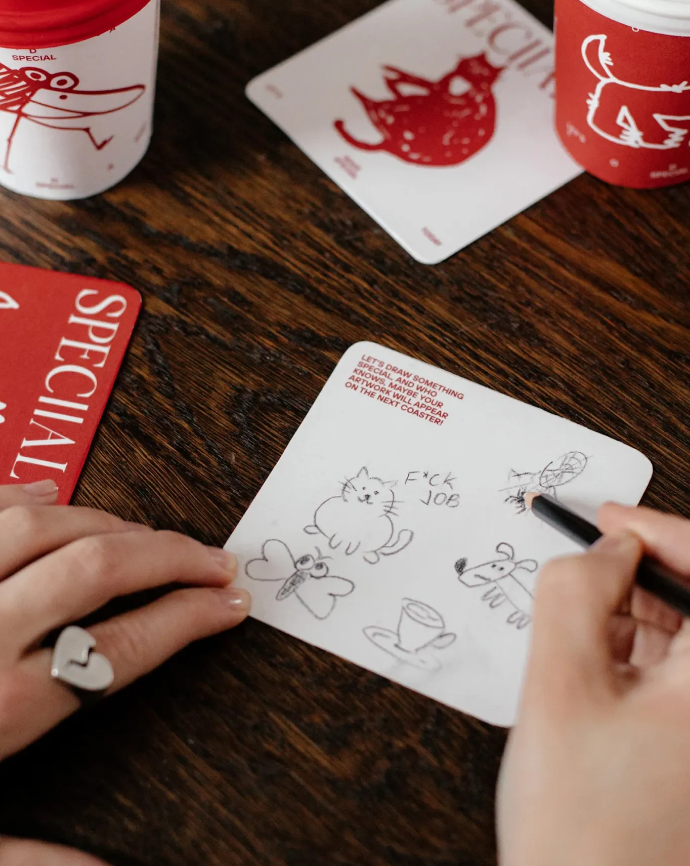
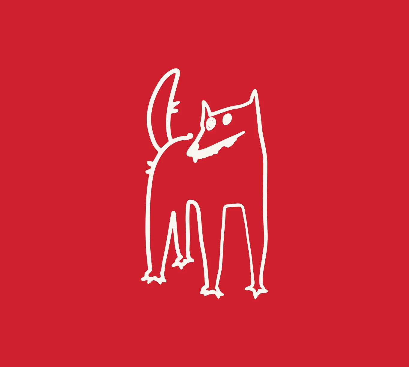
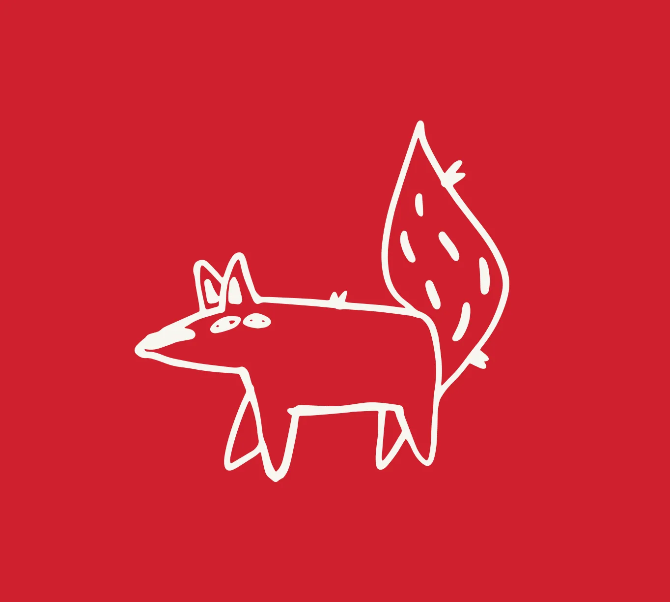
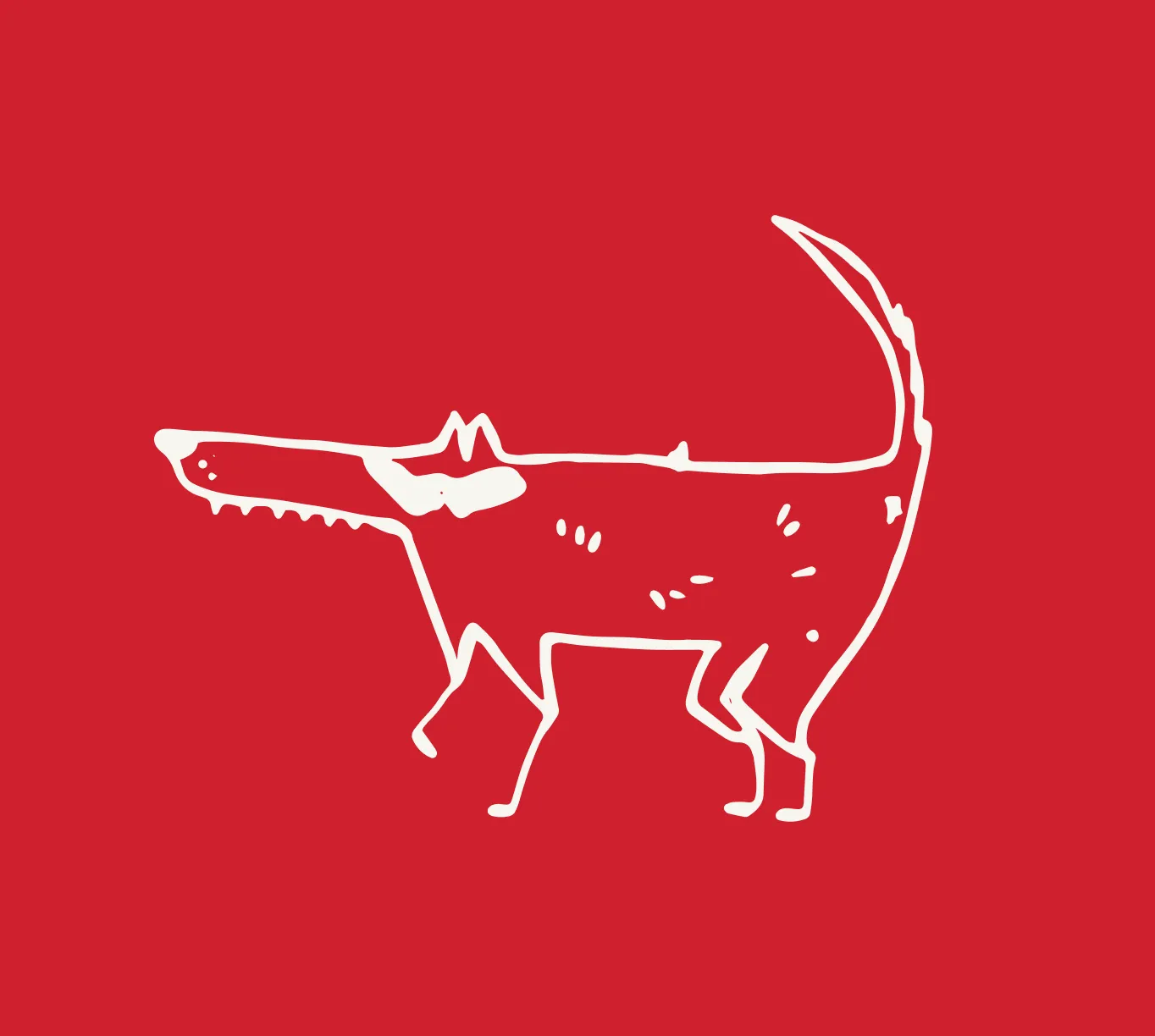
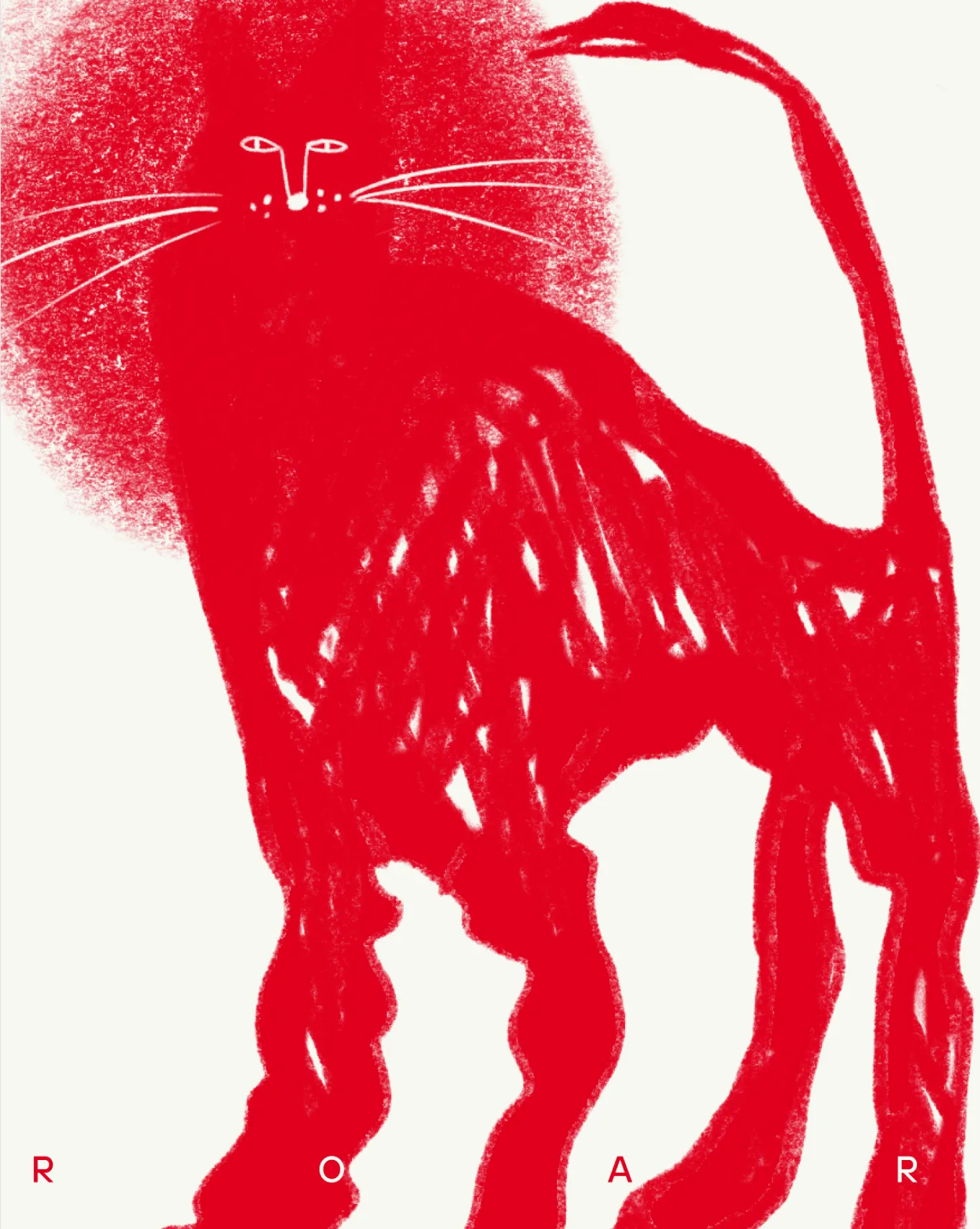
The main character of the brand is the Italian wolf, subtly referencing the brand’s roots. However, the identity also incorporates a variety of other images that reflect the individuality of Specialty's visitors.


[Brand essence as a visual approach feature]
Take a breath


Next Case Study
.svg)

Next Case Study
Next Case Study
Next Case Study
Next Case Study
Next Case Study

.svg)
Drop us a line at
ding@denormalized.co
Privacy & Cookie Policy